Importance of Data Visualization in the Digital Age
The year 2026 is all about faster business decisions—with accuracy. And to achieve this, data visualization offers its support. Today, data visualization is important because it transforms complex data into easy-to-comprehend visuals, which opens better communication channels between the technical and non-technical teams. And this happens because it simplifies cluttered datasets, enhances data exploration, and improves collaboration.
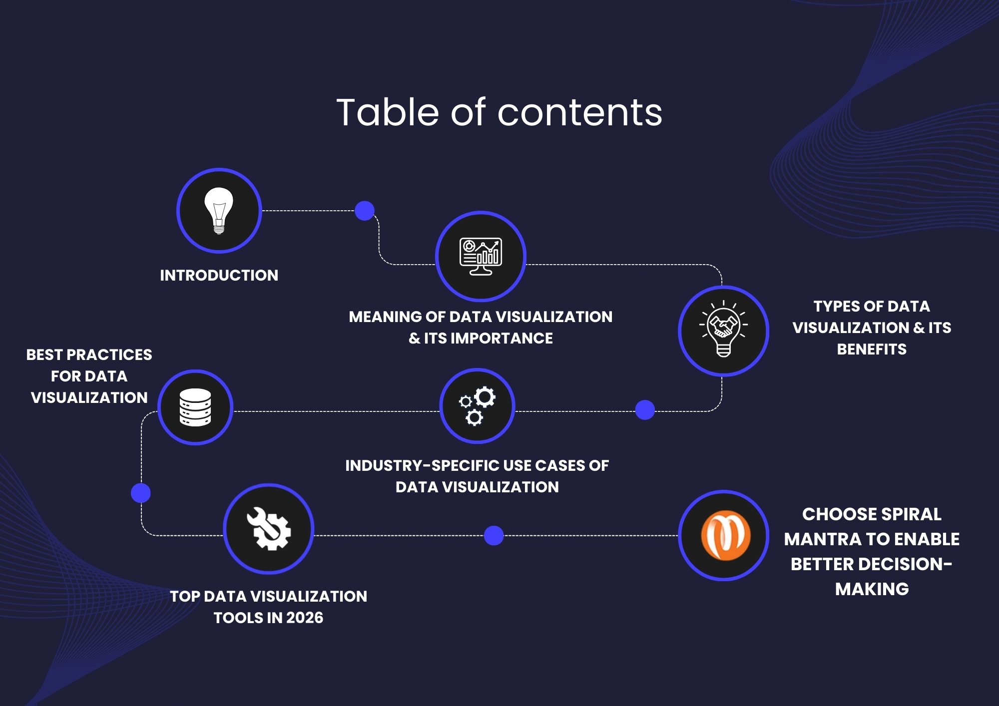
In today’s article, we will be exploring various facets of data visualization and how the right data engineering company can help you achieve your goals.
Meaning of Data Visualization & Its Importance
Lately, data is being generated left, right, and center. And its sheer volume means we need newer ways to understand what's going on! Every click, transaction, and swipe leaves data behind, and not knowing what to do with it can quickly turn into a major loss.
This is where data visualization comes to our rescue. In simple words, this term means presenting these large datasets as meaningful assets. And it could be presented in any format:right from a bar chart to maps, which can help us understand the whys and hows behind customer behavior and plan our next course of action accordingly.
Now, let’s take up a few examples to understand this concept better.
In retail, customers purchase or leave something in the cart regularly, and understanding their patterns can help us offer better products.
Similarly, in the finance industry, monitoring market trends, tracking portfolio performance, and conducting risk analyses can be a savior.
When it comes to public health, understanding which regions have seasonal outbreaks can help us track and prevent such recurring diseases.
In sports, evaluating every player's moves and strategies can help us place the right players on the team.
Now, let’s take a look at its relevance today.
The main goal of data visualization is to bring teams onto the same page. And guess what? It really does! Because human minds are wired to grasp visual presentations much better than scattered data.
Currently, every industry continues to reap the benefits of data visualization. However, as a famous anonymous quote states, "With greater power comes greater responsibility," it draws our attention to how data visualization can act as a double-edged sword. To understand this better, let's take an example of chart manipulation, which creates inaccurate results.
Types of Data Visualization & Its Benefits
At Spiral Mantra, a leading data modernization services company in the US, we use charts (bar, pie, heatmap, treemap, etc.) to make complex information accessible. We have listed below the various ways it has benefitted us:
Line Charts
Bar Column Charts
Heatmaps
Scatter Plots
Pie & Donut Charts
Treemaps
Line charts are effective for showing changes over time, such as revenue growth, temperature changes, or user adoption rates. In short, it helps quickly reveal growth, decline, and seasonality.
Best for comparing two sets at a glance, for example, sales by region, product performance, and departmental expense. In short, it can help C-suite executives glance through opportunities and trends at one go.
Ripe with color gradients, heat maps are known to represent informative data intuitively. For example, the U.S. Marine Corps once used heat maps to monitor their supply chain operations.
These highlight the relationship between two variables and are best for identifying correlations and outliers. For example, in corporations, scatter plots can be used to identify how learning & development activities correlate with actual employee productivity.
Known to show proportions of a whole, these charts are best utilized by market research firms to identify market share. For example, a high-level Apple executive often uses pie & donut charts to understand the competitive landscape between Apple and Huawei to gain a better picture.
Ideal for displaying hierarchy and proportions together, treemaps are best for complex datasets.
Now that we have taken a look at the different data visualization types, let’s dive straight in to discover their benefits.
Benefits of Data Visualization
When implemented correctly, data visualization techniques help business leaders in more ways than one.
Better decision-making
Improved monitoring
Improved storytelling
Identify errors
Predictive analysis
Presenting complex data in interactive chunks can support data-driven decision-making processes. Visual representation of datasets is known to promote better collaboration among team members and executives because of everyone’s ability to understand it quickly.
Provision of real-time tracking in data visualization dashboards eases operational challenges in industries that deal with a lot of data (example: banking). These representations allow one to easily track trends, patterns, and their hidden relationships, which causes business leaders to take timely action that saves monetary waste.
Storytelling is one of the core reasons people prefer data visualization techniques over others. It helps one’s target audience understand messages easily.
Effective use of data visualization helps one notice errors quickly. This helps teams work better because errors are identified easily and can be rectified before they blow out of proportion.
Modern data visualization tools, like Tableau, Power BI, and Qlik Sense, make it easy to identify trends and reveal outliers. This can help businesses predict future trends based on historical data.
Now that you have a clear understanding of the different benefits of data visualization, let’s move on to its industry-specific use case.
Industry-Specific Use Cases of Data Visualization
Let’s explore how this technique helps various industries.
Manufacturing
Media & Entertainment
FinTech
Healthcare
Data visualization tools help identify production challenges and areas of improvement. Real-time tracking helps manufacturers figure out what’s slowing their production line. This helps them understand which pain points need to be improved.
At Spiral Mantra, a top data modernization services company, we recently implemented data visualization techniques for a leading cement manufacturing company. Our modern solutions help them identify challenges and mitigate them better. In fact, we were able to improve their business processes by up to 70% after implementing Power BI solutions.
For media and entertainment businesses, showing the right ad to the perfect consumer is important. And to perform this, ad agencies start by visualizing historical campaign performance that lets them understand the demographics, behavior, and interests of their target audience. The data is then used to optimize their next campaign.
FinTech firms are the ones who benefit most from data visualization techniques. These tools help them spot irregularities in financial data, detect fraud-related patterns, and reduce associated losses.
Another important aspect of FinTech firms is the need to easily understand financial data to gather insights into market trends. As a trusted data engineering company in the USA, we often use techniques such as line charts, heatmaps, and treemaps, among others, to achieve our goal.
Implementing data visualization techniques in healthcare services can detect irregularities, recognize patients at risk of complications, and ensure they receive personalized treatment.
Best Practices for Data Visualization
82%* businesses think data visualization techniques help make better business decisions. Here are some of the key practices we follow:
Define a purpose
Embrace simplicity
Use the right color
Effective data visualization begins when you have a purpose. To achieve this, ask the right set of questions. For example, CEOs may need overviews, while data teams may need granular drill-downs. Therefore, when the objective is clear, the design naturally becomes more impactful.
Complex visuals are challenging to understand. Simplicity ensures that busy executives are able to grasp the meaning quickly. At our data engineering services company, we remove unwanted decorations that may impact a business leader’s decision-making process, because we believe ‘simplicity is the key'.
Colors have a deeper meaning than making a visual attractive. Therefore, we keep palettes that complement each other while offering accessibility to a color-blind audience.
Top Data Visualization Tools in 2026
While there is a broad spectrum of tools that make data visualization easy, choosing the right one is the key to better business decisions. Here’s a list of the top tools we use:
Microsoft Power BI
Tableau
Apache Superset
A popular data visualization and business intelligence tool, Power BI allows users to create interactive dashboards.
We can help you with our comprehensive Power BI consulting services to extract insights to make business decisions on the go.
Another popular tool, Tableau, helps integrate with multiple sources to import data in a very short time.
An open-source, cloud-native data visualization tool, Apache Superset provides a code-free visualization builder to extract and present data.
Choose Spiral Mantra To Enable Better Decision-Making
Spiral Mantra, a trusted data engineering company, can help you transform business data into actionable insights. With a collaborative approach, our data engineering experts create intuitive dashboards that can drive your business. From technology consulting to implementation and its support, we are your one-stop solution for all your data visualization needs.